About the QÚ Restaurant
I was given the task to develop a brand for a contemporary eatery. Qú is an elevated Mexican restaurant with a menu that focuses on Spanish-style tapas.
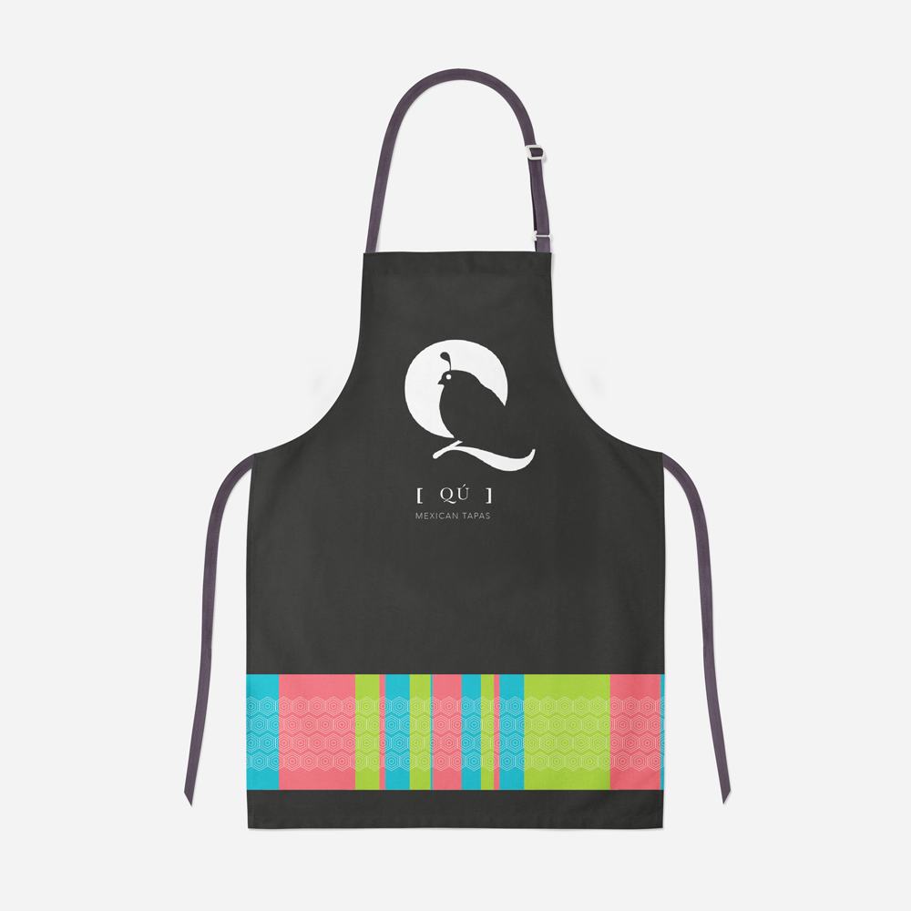
The overall look of the brand is inspired by the elegance of the letter Q from the “Baskerville” typeface, the brand revolves around the image of a quail since is the specialty dish which also plays an important role throughout the system.
The name is of Mexican origin and it is the onomatopoeia sound of a quail (Cú or Coo) To make the system fun and appealing to younger folks, the words that include the letter C or K are reworked to include the letter Q instead, for example: “GuaQmole”, “Qocina”, and “MarisQada”.
School Project:
Texas State University
Responsibilities:
Art Direction, Brand System, Collateral Design, Conceptual Design, Graphic Design, and Packaging Design.

MENU

AMBIANCE


PACKAGING DESIGN


CATERING VAN

-
![]()
Business Card
-
![]()
Apron
-
![]()
To Go Bags